Aunt Benny Cafe
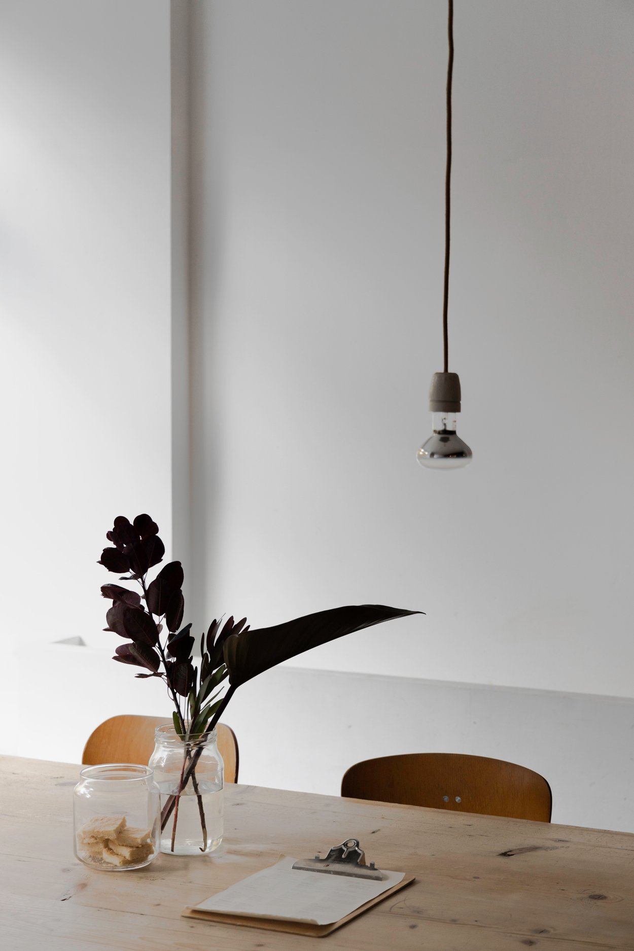
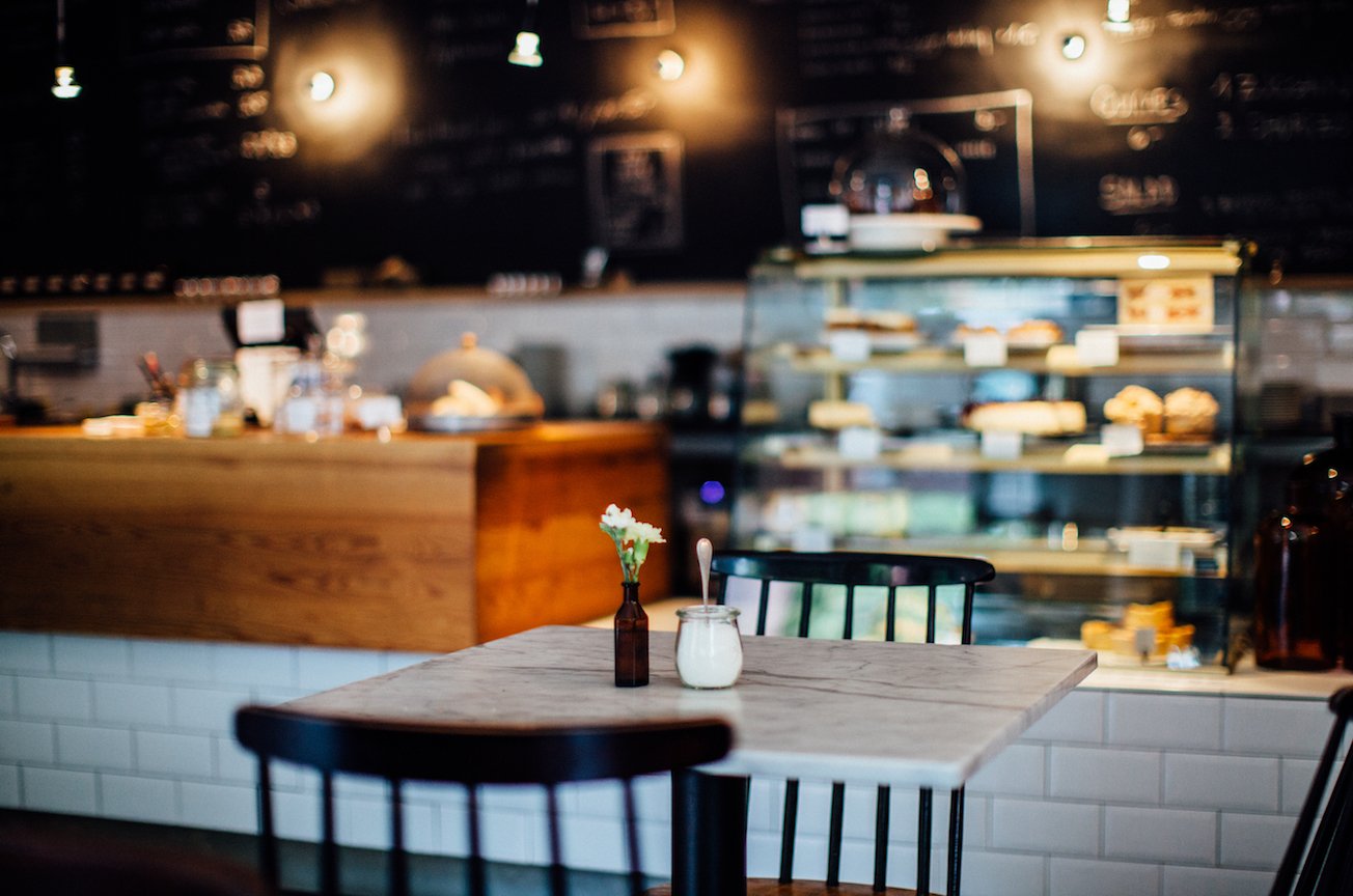
The Berlin 2008 café scene was an entirely different landscape to what it is now. Unlike other cafés in the city, it was important that the ordering and paying could be done at the counter, guests could seat themselves, and food could be displayed at the front. We wanted a range of seating options from a large communal table, cosy bench seating, a couple of mid-sized 4-tops, and pillows at the windowsill for the lone diner wanting an unobstructed view of the park. We added a plant wall to hide an awkward ledge in the space which, in-turn, added to the overall warmth of the design.
As the popularity of the café grew the kitchen was redesigned with an added pass in the wall, and a water station was added to the front counter to alleviate the work of the staff. In lieu of signage, we opted to have the logo hand painted with gold leaf on both of the picture windows, creating brand recognition on both the exterior and interior of the space.
We designed a bench with attached table configuration that could stay outside all year long which gave a welcoming and open look to the building even on the most unwelcoming of days and reduced the work of the staff to have to set out tables every morning. And with our seating doubling on warm weather days, we created a numbering system to allow guest to keep their tabs open and encourage ordering additional courses without the hassle of having to pay every time. We created a clear and concise one page menu so that one guest could order on their party’s behalf. Due to the intuitive and ever changing design Aunt Benny was abuzz all seasons of the year.


