Black Window Frames
A contractor recently noted that soon we will be looking back at this time and seeing the obvious trend of black window frames that is no longer desired. That’s when I started to loose sleep. I’m getting back window frames. Am I just following a trend?
I wrestled with this question for quite some time and have come to defend (to myself) my decision for the following reasons.
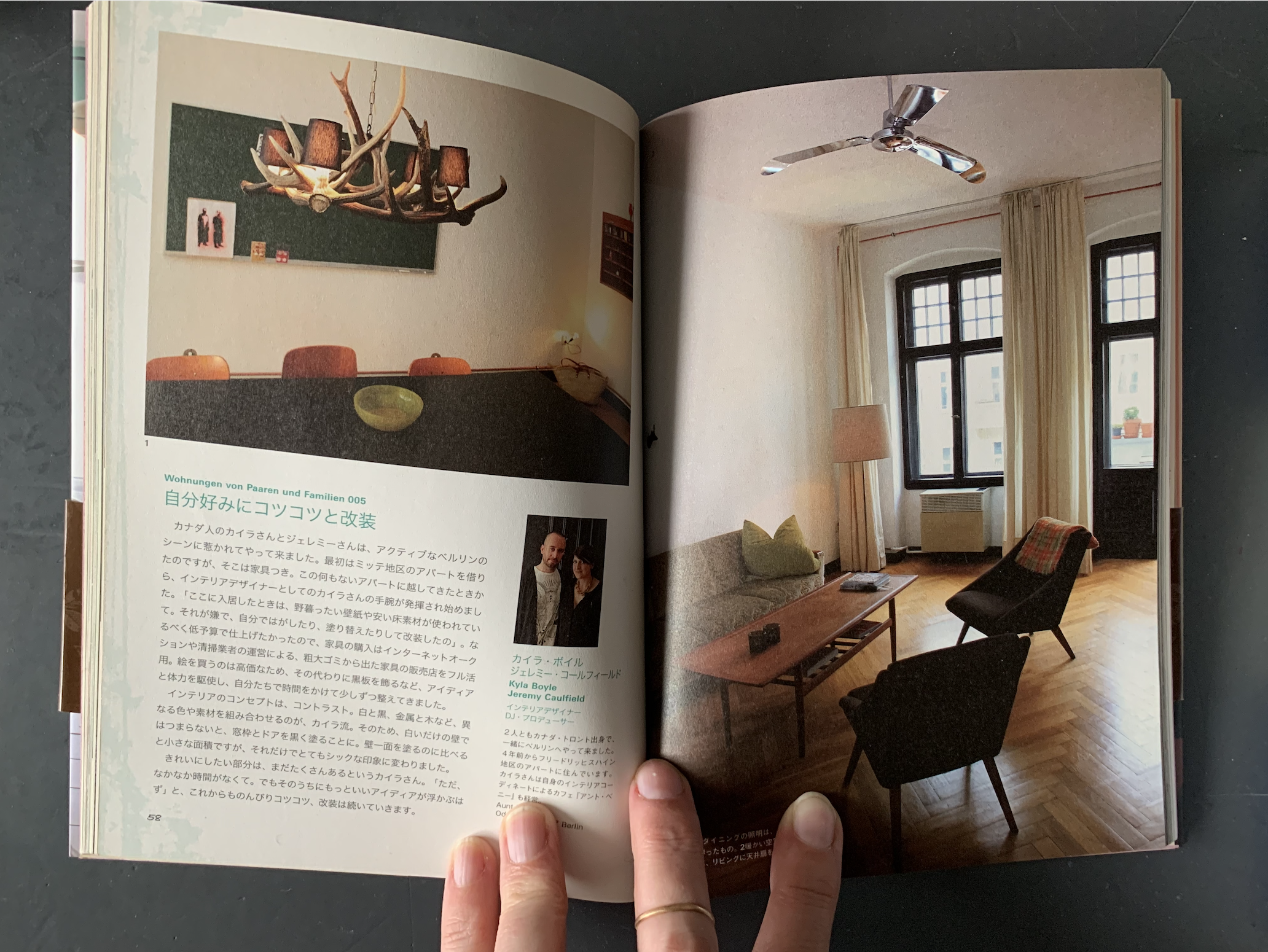
Our first flat made it into a Japanese book by Tatsumi Publishing Co. Ltd.
I’ve been doing black window frames for years. When we looked at our first real flat in Berlin, so many years ago, it was a dump but since I love a project, we took it. I knew on that first visit that black window frames, black trim, and black “Flügeltüren” would make the place great. That and ripping out the partition between the rooms, stripping the multiple layers of paper (that were even on the 12’ ceiling!), removing the half level floor in the bedroom, building a walk-in shower, installing a new kitchen, and, and, and… I can’t believe all that we did for a rental!! Anyway, I loved the effect. When you look out the window, you don’t see the frame. The black blends with what’s outside.
Trends are definitely a thing in Toronto. I never really concerned myself with what was or wasn’t a trend when I was living in Europe. There is so much going on architecturally: new, old, really old, east, west, pre-war, post-war, cold-war. Black window frames have been around though them all.
Bauhaus! I love anything and everything Bauhaus. I literally learned German and moved to Germany to be closer to the former school, well, that and techno. Bauhaus’ iconic white walls, black windows, splashes of colour, functional lines and forms are the reason I became a designer. Please note: I am fully aware that this humble suburban home has no likeness to Bauhaus, just saying… that’s not a trend.
The exterior extension of the house is black. I tried to steer away from pure black. I ordered countless samples of non-black siding, but I just didn’t like them. The sunlight would make them look purple or green. The way we designed the extension was to accentuate the pure lines of the barn-like form. The front peak is has flush fascia and the sides have open soffits. Like if a kid drew a barn: no fancy stuff. The windows should not distract from the form, therefore black on black is best.
Finally, I decided to stick with the black decision, because the interior of the windows are wood and once they are in, they are finished; no need for any additional painting. If I really want to change it down the road, when I discover I fell for a long trend, there is always the option to repaint them.

